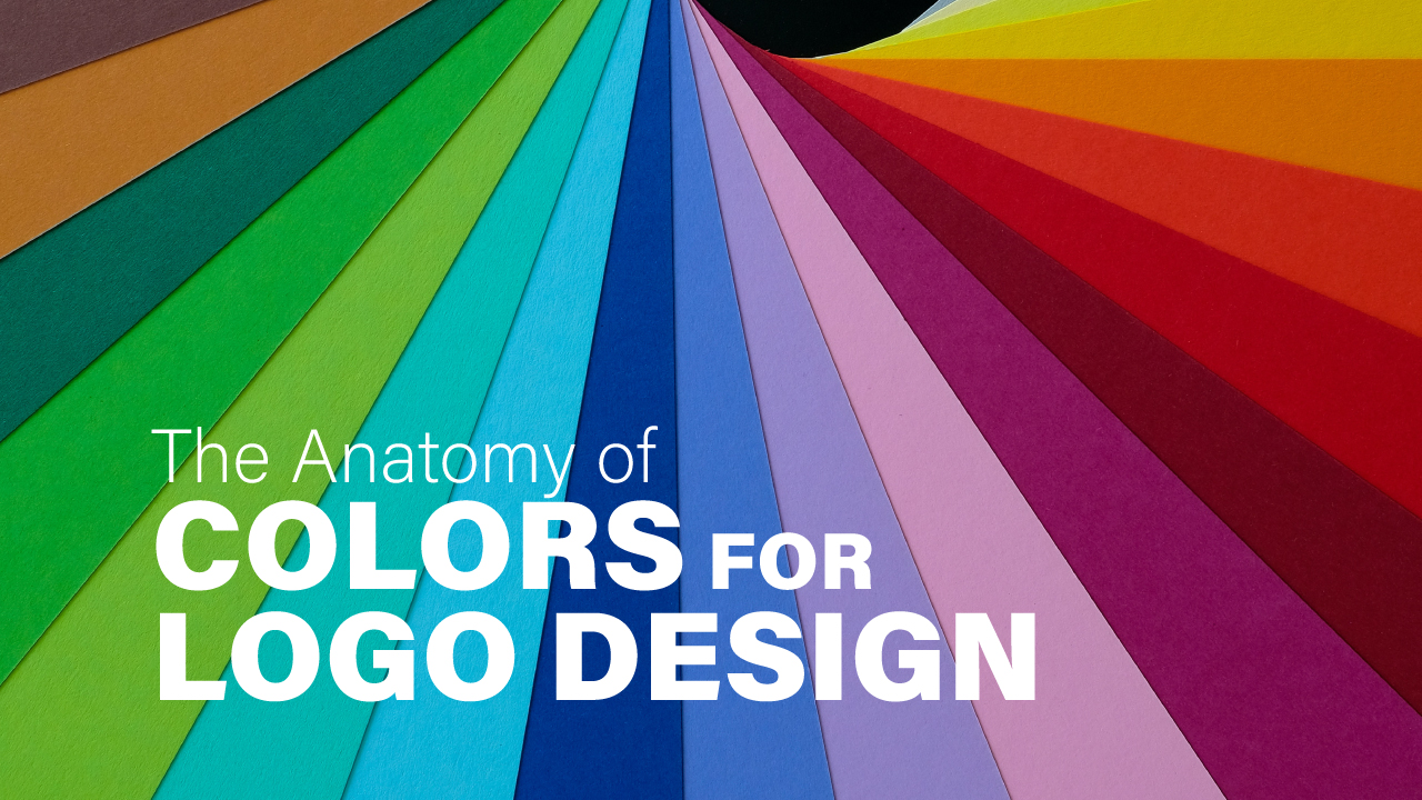
The Anatomy of Colors for Logo Design
Anatomy of colors is simple yet complex wheel in logo designing. Designing a logo is probably a lengthy process that consists of many vital steps. One of the key points for a logo designer is to select the right color of the logo as it will represent the whole brand identity and hence should match with the company’s perspectives. Choosing the correct color palette improves the ability to give your brand more visibility, self marketing & brand’s growth. Hence the color depends on many little things for developing a character for the brand.
The legitimate color will deliver a loud and clear message and will enable the customers to connect on an emotional & psychological level. Hence, colors help your audience to generate an instant feeling that creates a particular mindset of the brand without having any prior experience of using the brand’s service or product.
Science has repeatedly proven that different colors trigger different reactions in our brains. Moreover, the more you understand how colors affect our minds, the more effective your brand can be. It’s important to remember that this is a complex field that requires careful thought. Let’s consider how colors affect emotions, psychology & marketing by breiefly understanding the anatomy of colors.
Anatomy of Colors Affecting Marketing
Colors elicit emotions, arouses feelings that associate you with the brand and instantly makes a connection emotionally. By choosing a color that reflects your brand’s identity, you can influence your audience, whether your brand is standing out or blending in with the trends in the market. Thus, it is important to know what each color represents in order to reach your target audience.
Anatomy of Colors
Red Color
Red is a popular branding color, symbolizing passion, anger, enthusiasm, health & fitness. It is one of the primary colors in and is most used by brands to get noticed. If you want your logo to be a loud, playful, and young brand image, red is an ideal option.
Red color commonly associated with :
- Gentleness
- Energy
- Romance
- Warmth
- Love
- Comfort
Yellow
Yellow is a warm color that evokes happiness, friendliness & warmth. Mostly yellow is used for the F & B sector to highlight and embrace youthful energy among the audience. Apart from the F & B sector, yellow is vividly used for brands that display excitement like dancing academy or a studio.
Yellow color commonly associated with:
- Friendly
- Cheerful
- Youthful
- Energy
- Positivity
- Happiness
Anatomy of Color Orange
Orange is yet another color that comes from the same family of yellow. The characteristics of orange can be compared to those of red and yellow since they are made by mixing them together. Orange is another favorite color for sports, food, travel & art industries as it emits a sense of happiness, energy & warmness.
Orange color commonly associated with:
- Energy
- Excitement
- Prosperity
- Warmth
- Playfulness
- Change
Shades of Blue
As you can see, 80% of the brand logos are blue in color as the color inspires a sense of calmness, trust, credibility and sophistication. Brands like, SBI, Twitter, Facebook, Dell, Paytm, Oreo, Pepsi and more. If you need your brand to build confidence and professionalism, blue is your go to color regardless of any sector. Blue alone is the only color that is suitable in all sectors.
Blue color commonly associated with:
- Wisdom
- Loyalty
- Spirituality
- Mystery
- Sophistication
- Respectability
Green
Green is one of the colors that doesn’t require one to be attentive to see. It is a more restful and calming color and can be found everywhere. The color stimulates balance, serene and a connection with nature. Moreover the green also represents new beginnings & renewal. Brands catering to technology also prefer to use green in their logos to stimulate a growth
Green color commonly associated with:
- Nature
- Health
- Wealth
- Tranquility
- Harmony
- Fertility
Anatomy of Colors – Purple
Purple is the best option for a brand who is grand, luxury & royalty. The color is associated with royalty and power as in ancient Romans, the king’s cape was always purple in color. Purple color is generally used by cosmetics brands & high retail companies. It is also good to go color to showcase creativity.
Purple color commonly associated with :
- Spiritual awareness
- Luxury
- Authenticity
- Truthfulness
- High quality
- Introspection
- Royalty
Anatomy of Multicolor
Using multicolor in the logo represents creative, fun and playful energy. Therefore, the majority of businesses with multicolored logos are multi-disciplinary businesses like real estate, travel and tourism, and technology companies.
Multicolor commonly associated with
- Diversity
- Openness
- Informal
- Creative
- Playful
- Cheerful
Use the power of Colors
To be successful, a logo needs to be recognized by its customers. It becomes critical to pick a color scheme that is significantly different from that of your main competitors if you want to differentiate yourself. The anatomy of colors is a helpful to choose for your brand. It also helps in creating the base of brand identity theme.
There are times when choosing a color for your brand might seem like the most straightforward thing to do. But it is also one of the tough choices to make as the brand’s marketing relies on the same. Hence, this explains why specific logo colors become prevalent in brand marketing.
Related Post

Brochure Design Checklist
Brochure design is an essential part while you are planning to do branding. A brochure…
Packaging Design Prerequisites
Packaging Design prerequisites are very vital before you start designing. Moreover, the packaging design is…
There are no comments